After researching existing professionals to use as crew members on my billing, I am now able to make up fictional biographies for my cast members. I wanted to use real crew to give my film authenticity but I feel that I should make up my cast as it will be impossible for me to use real actors (such as Ryan Gosling or Scarlett Johannsen) in my film. These actors would inevitably feature in any marketing campaign (on the poster, magazine cover and in the trailer) and I don't want to use found images. I have, therefore, created fictional biographies for made-up actors.
Kate Miller - Similar to A-list actress Eva Green, Miller jumped in at the deep end starring in horror blockbuster "Mirrors 3", before earning the lead role in all five of the "Truth or Dare" horror films. Along with being one of the most recogniseable scream queens of the 21st century, Miller has also played the central protagonist in "Criss Cross", "Brick Squad", "Captain Fantastic" and "It's All About Love".
Scott Wilde - Wilde has been named the 5th sexiest man in the UK according to Glamour magazine. Starting his career in the theatre, Wilde starred in a 2008 production of "The Woman in Black" and then went on to win the lead role in John Carpenter's "Death Row". Wilde has also starred in "Masks", "Fear Journey" and "Mystery Island".
Elizabeth Jenkins - Up and coming actress Jenkins is most well known for starring in the Horror TV series "Death Tower". Craven stated that Jenkins' "ability to adapt herself into any role given to her" is the reason why she has been given a lead role in "The Mourning" over any other actress.
Jack Gold - Starring alongside Brad Pitt in "Vanished", Gold has been churning out new movies for years. Placing "The Mourning" under his belt will mean he has acted in 15 horror movies, these include "Absent", "Birds That Never Sleep" and "Creeper".
Monday, 25 November 2013
Sunday, 24 November 2013
My Billing
Now that I have decided on the cast and crew for my film I have created my own credits which I will include at the bottom of my poster (and, in a slightly different format, towards the end of my teaser trailer).
My previous research on existing billings from posters of horror movies helped me with the layout and order that people appear in the credits, and also in choosing appropriate people for the billing who had worked within the genre before.

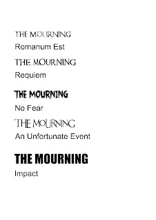
To construct the billing I downloaded the font "SteelTongs" from www.dafont.com and put it together on Photoshop Elements.
 The font is organised so that it replicates the font used on the billing of most movie posters.

My previous research on existing billings from posters of horror movies helped me with the layout and order that people appear in the credits, and also in choosing appropriate people for the billing who had worked within the genre before.
To construct the billing I downloaded the font "SteelTongs" from www.dafont.com and put it together on Photoshop Elements.

Saturday, 23 November 2013
Film Title
After deciding the premise of my film, I now need to think of a name.
My film is about a single mother who moves into a new house with her two children after something stressful happened in their last house. While her children are playing one of them mysteriously disappears or has died. Supernatural things begin to happen in the house which seems to connect to the missing child.
Once I had come up with a list of possible names that would be suitable for a film from the horror genre, and would also reflect the narrative of my film, I held a focus group to see which film title was most popular - the results are below:
Gone - 2/10
Trauma - 5/10
Abduction - 4.5/10
Absent - 6/10
Forgotten - 1/10
Lost - 2/10
Vanished - 7/10
Snatched - 5/10
Erasure - 8/10
Birds that Never Sleep - 8.5/10
The Mourning - 10/10
The Tenant - 7/10
The Devil's Breath - 9/10
The Shadowing - 9/10
As "The Mourning" is most popular (and was in my top five), I have decided it should be the title of my film.
Friday, 22 November 2013
Potential Cover Lines and Banners for my Magazine
Every single magazine cover I have looked at features appropriate cover lines for the magazine's target audience - regardless of whether it is a mainstream magazine featuring Hollywood blockbusters or an independent magazine featuring low budget British films.


Cover lines are something audiences expect to find on a magazine cover so I will include them on mine. I ideally want to do a Horror movie special edition of a mainstream magazine, so I have thought of potential cover lines that reference horror.
I would like to include two cover lines which reference old horror films (as this is a horror special) with one of them in a circular banner. I would also like to include a banner at the top, near the masthead with Ultimate Horror Special inside it (in contrasting colours). I want everything else referenced to be horror films that are coming out around the same time, autumn 2013.
1. Exclusive Interview with the Master of Horror - John Carpenter (possibly in a circular banner) - included as this is a horror special and he may have a new film to promote
2. Behind the Scenes - On Set with the Cast of "The Evil Dead" - included as "The Evil Dead" is a recent horror film
3. Jamie Lee Curtis VS Sissy Spacek - Battle of the Scream Queens! - included as it is a horror special and it will help promote the remake of "Carrie"
4. The Top 10 Gothic Horror Films
5. Michael Myers Unmasked! - a special feature on the "Friday the 13th" franchise
6. "Carrie" - Chloe Grace Moretz - Reinventing "Carrie" for a New Generation - included as "Carrie" is a new horror release
7. "The Conjuring" - James Wan - Horror Maestro Returns with "Insidious: Chapter 2" and "The Conjuring" - included as the director has two new films from the genre coming out
8. Names of horror films to appear as separate cover lines - "You're Next", "Random", "Haunt", "Paranormal Activity 5", "The Amityville Horror: The Lost Tapes", "Ghosts" - included as magazine cover lines are often simply the names of forthcoming films. All of these films are from the horror genre
9. Battle of the Horror Film Franchises - "Saw" vs "Scream"
Monday, 18 November 2013
Primary Research - Magazine Questionnaire
As part of my primary research into audience expectations I created a questionnaire regarding film magazines.

I distributed the questionnaire to people living in London over the age of 15 (my film's target audience), asking them what they expect to find in a film magazine, and the ways in which layout, design and content would persuade them to buy the magazine. Here are the results:
1. What do you expect to see on the cover of a film magazine ?
- A recognisable star/character
- Barcode
- Price
- Issue number
- Indication of the content
- Masthead
- Banners
2. What is it about the layout and design that encourages you to buy film magazines?
- Bright colour scheme
- One dominant central image
- No clutter on the cover
- Clear, easy to read, cover lines
3. What content to you expect to find in a film magazine?
- Reviews
- Features
- Interviews
- Posters
Sunday, 17 November 2013
Potential Film Magazine Names
The masthead (the name of the magazine) is the biggest font on the cover, so it is important to make sure that the same is catchy and noticeable.

I reduced my name choices down to 5 and did a focus group of 30 people over the age of 15 (my demographic). Here are their results:
1. Picture This - The majority of people in the focus group really liked this title, with most saying it was catchy. However some suggested that the title does not directly sound like a film magazine.
2. Reflection - People in the focus group thought this title was quite arthouse and didn't really reference film at all (certainly not mainstream movies).
3. Take 1 - The focus group responded positively to this title as they said it was catchy and memorable. Some members said that the number 1 implies that it is the best.
4. Zoom - This title was quite popular with the focus group, however when hearing the other titles most changed their mind, with one suggesting that this title was "nothing special".
5. Have You Scene It? - People in the focus group thought the pun was quite humorous but they also commented that the title was far too long and not catchy enough, with some also saying they though this was far too cheesy.
6. Reel Film - This magazine name proved to be the most popular in the focus group as they liked the play on words and thought it was a catchy and memorable name. Most said they would notice it on a magazine rack.
As a result of the response from the focus group, I have decided to choose Reel Film as my title. I will begin looking for suitable fonts and think about the colour and layout of the masthead.
Saturday, 16 November 2013
My Chosen Certificate
I have decided to give my film a 15 certificate, partly because the demographic who make up the main body of the audience for horror movies are adolescent males.
If I made my film an 18 of course I would have much more freedom to go in any direction I wanted and would have fewer limitations on things like language, violence and pure horror. I would, however, then be eliminating a large proportion of the audience and would make my film less successful.
If I were to give my film a 12A certificate I would be able to have a wider audience but I do not think I would be able to fulfill typical audience expectations of a horror film. In relation to a 12A certificate the BBFC states “There should be no emphasis on injuries or blood, but occasional gory moments may be permitted if justified by the context”, however with a 15 certificate they state “The strongest gory images are unlikely to be acceptable”. Whilst that puts a barrier up on the violence content it still means I would be able to include more violence than a 12A, and sometimes violence is the core of a horror movie.
If you would like to read more about exactly what is acceptable at 15 - please click on the link below.
Friday, 15 November 2013
BBFC Research - Certificate for my Film
I have researched three certificates from the BBFC website - 12A, 15 and 18. I have only chosen to look at these three because they are the most realistic certificates for horror movies (though very few films from this genre receive a 12A as it means the film will contain less blood, gore and sustained frightening moments).
From my research I will select a certificate for my film, this will give me the guidelines I need when deciding on suitable content at that level.

The following guidelines for 12A that may be related to the horror genre include:


The following guidelines for 18 that may be related to the horror genre include:

The following guidelines for 12A that may be related to the horror genre include:
- Moderate physical and psychological threat may be permitted, provided disturbing sequences are not frequent or sustained.
- Dangerous behaviour (for example, hanging, suicide and self-harming) should not dwell on detail which could be copied, or appear pain or harm free.
- Easily accessible weapons should not be glamorised.
- Moderate language is allowed. The use of strong language (for example, ‘fuck’) must be infrequent.
- Nudity is allowed, but in a sexual context must be brief and discreet.
- Sexual activity may be briefly and discreetly portrayed. Sex references should not go beyond what is suitable for young teenagers. Frequent crude references are unlikely to be acceptable.
- Mature themes are acceptable, but their treatment must be suitable for young teenagers.
- Moderate violence is allowed but should not dwell on detail. There should be no emphasis on injuries or blood, but occasional gory moments may be permitted if justified by the context.
- Sexual violence may only be implied or briefly and discreetly indicated, and must have a strong contextual justification.
Considering that my film is likely to include weapons, sustained physical and psychological threat and emphasis on gore and blood, it is unlikely that the film would receive a 12A certificate.

The following guidelines for 15 that may be related to the horror genre include:
- Strong threat and menace are permitted unless sadistic or sexualised.
- Dangerous behaviour (for example, hanging, suicide and self-harming) should not dwell on detail which could be copied.
- Easily accessible weapons should not be glamorised.
- There may be frequent use of strong language (for example, ‘fuck’). The strongest terms (for example, ‘cunt’) may be acceptable if justified by the context. Aggressive or repeated use of the strongest language is unlikely to be acceptable.
- Nudity may be allowed in a sexual context but without strong detail. There are no constraints on nudity in a non-sexual or educational context.
- Sexual activity may be portrayed without strong detail. There may be strong verbal references to sexual behaviour, but the strongest references are unlikely to be acceptable unless justified by context.
- No theme is prohibited, provided the treatment is appropriate for 15 year olds.
- Violence may be strong but should not dwell on the infliction of pain or injury. The strongest gory images are unlikely to be acceptable.
- Strong sadistic or sexualised violence is also unlikely to be acceptable. There may be detailed verbal references to sexual violence but any portrayal of sexual violence must be discreet and have a strong contextual justification.
It is likely that my film will fall into this category - this will allow me to reach a wider audience than an 18 (which would please the production and distribution companies), whilst still maintaining the necessary threat that is so important in the genre.

The following guidelines for 18 that may be related to the horror genre include:
- In line with the consistent findings of the BBFC’s public consultations and The Human Rights Act 1998, at ‘18’ the BBFC’s guideline concerns will not normally override the principle that adults should be free to choose their own entertainment. Exceptions are most likely in the following areas:
- where the material is in breach of the criminal law, or has been created through the commission of a criminal offence
- where material or treatment appears to the BBFC to risk harm to individuals or, through their behaviour, to society – for example, any detailed portrayal of violent or dangerous acts, or of illegal drug use, which may cause harm to public health or morals. This may include portrayals of sexual or sexualised violence which might, for example, eroticise or endorse sexual assault
- where there are more explicit images of sexual activity which cannot be justified by context. Such images may be appropriate in ‘R18’ works, and in ‘sex works’ would normally be confined to that category.
Thursday, 14 November 2013
Potential Magazine Cover Layouts
Before I can design my magazine cover I need to sketch some possible layouts. Looking at other magazine covers for both mainstream and independent audiences really helped me with this task as it allowed me to see the variety of different layouts used in magazine covers, and also how it changes depending on if it is a mainstream or independent magazine. Having looked at the design and layout of mainstream magazines, I have completed some basic layout sketches of my magazine cover.
Below are my layout sketches:


Below are my layout sketches:
Wednesday, 13 November 2013
Potential Crew for My Billing
In order to create my billing/credits I needed to compile a list of the crew who would work on the production of my film. I used IMDB to research various people, for example, Editors, Producers and Casting Directors, to find some who had previously worked on many horror films - I want to use the names of real people for my crew to give the poster and teaser trailer an extra layer of verisimilitude.


Novel by - Stephen King - One
of the most well-known writers of horror novels of all time, King has written
many novels that have gone on to become critically acclaimed feature films. These
include: “Carrie”, “Salem’s Lot”, “The Shining”, “It”, “Misery” and “Christine”.

Director - Wes Craven -
Primarily a writer, Wes Craven has gone on to become one of the most renowned
creators of Horror films of all time. Some of his more recent work includes “My
Soul to Take” and “Scream 4”. However he is credited with directing the
original “A Nightmare on Elm Street” (which he also wrote), “The Last House on
the Left”, the original “The Hills Have Eyes” and the entire “Scream” series.
Executive Producer - Sam Raimi -
The co-founder of Ghost House Pictures was first noticed after producing the
original “The Evil Dead”. During the prime of his career he placed several
Horror films under his belt, including “Drag me to Hell”, “The Messengers”,
“Boogeyman” and “The Grudge”. His most
recent work includes the remake of his original production “The Evil Dead”, “The
Possession”, and he has now been announced as the producer of the remake of the
1982 Horror classic “Poltergeist”.
Co Producer - Joseph Drake -
The second half of the pair who founded Ghost House Pictures, Drake has been
involved in many of Raimi’s ventures, including “The Possession”, “Drag Me to
Hell” and “The Grudge”.

Produced by - Jason Blum - Blum
is credited with producing the terrifying “Paranormal Activity” films.

Produced by - Richard Saperstein - Produced one of King’s popular novels “The Mist”. Saperstein has produced many more Horror films, including “Se7en” and “Mother’s Day”.

Produced by - Richard Saperstein - Produced one of King’s popular novels “The Mist”. Saperstein has produced many more Horror films, including “Se7en” and “Mother’s Day”.
Cinematographer - Maxime Alexandre -
This director of photography has worked on many horror films previously, for
example “The Crazies” and “Mirrors”. More recently he has done the
cinematography for the sequel “Silent Hill: Revelation 3D”.

Casting - Lisa Fields - Its
lucky to find a casting director that works almost exclusively on Horror films,
and that is what Fields does. The Horror films that she has cast for includes
“The Innkeepers”, “The Amityville Horror”, “The Texas Chainsaw Massacre” and
“Friday the 13th”

Costume Designer - Leslie Kavanagh -
Kavanagh worked in the costume department for all but one of the “Saw” series.

Music Composer - Christopher Young -
Young has written music for a total of 110 titles. Included in those titles are
many films belonging to the Horror genre. For example: “Drag Me to Hell”, “The
Uninvited”, “Sinister”, “Urban Legend” and “The Exorcism of Emily Rose”.

Production Designer - Anthony
Tremblay - As a production designer Anthony Tremblay has worked on many
horror films, for example “Halloween” and “The Devils Rejects”.

Editor - Michael N Knue - Knue
has edited many horror movies, in particular remakes of Japanese classics like
“Shutter” and “The Ring 2”.

Make up Department Head - Eleanor
Sabduquia - Make up is an extremely important element of any horror film.
Sabduquia has worked on the sets of “Saw” (the type of film where make up is
essential), “Insidious”, “Paranormal Activity 2” and “Boogeyman 2”.

Visual Effects Supervisor - Jason
Piccioni - “Sinister” is primarily the most recognizable horror film that
Piccioni has worked on. However he was also the visual effects supervisor for
several episodes of what has rapidly become one of the most critically
acclaimed horror series of all time - “American Horror Story”.

Tuesday, 12 November 2013
Billing/Credits Research
On almost every poster that I looked at, I noticed the credits for the film - often at the bottom f the poster. Similarly, when looking at teaser trailers I found that a version of the billing appeared at the end of the trailer. In order to help me create my own billing or credits (so that my poster and teaser are authentic), I will need to analyse one from an existing horror film poster. The one I have chosen are from the poster for "The Strangers".


Monday, 11 November 2013
Potential Production Companies
Like all the teaser trailers I have looked at, mine needs to have a production company logo at the beginning (and also production company logos at the bottom of my poster), and in order to do this I need to choose a possible company (or companies) which may produce my film. I have looked at different horror films and compiled a small list of companies who could potentially distribute and produce my film.

Screen Gems is an American film production company and a subsidiary company of Sony Pictures Entertainments', Columbia TriStar motion picture group. Screen Gems have produced and distributed many Horror films, however most of them are remakes, for example "Prom Night", "The Stepfather" and most recently "Carrie".


Screen Gems is an American film production company and a subsidiary company of Sony Pictures Entertainments', Columbia TriStar motion picture group. Screen Gems have produced and distributed many Horror films, however most of them are remakes, for example "Prom Night", "The Stepfather" and most recently "Carrie".
Ghost House Pictures is a horror feature production company. Some of their more recent production work includes "The Possession", "Drag me to Hell" and the remake of "The Evil Dead".

Relativity media is an American film company which acquires, develops, produces and distributes films. It was founded in 2004 by Ryan Kavanaugh. Some of their highest grossing films include the horror films "House at the End of the Street", "Season of the Witch" and "Shark Night 3D".
Summit Entertainment is American film studio and a subsidiary of Lionsgate Entertainment. Its headquarters are based in Universal City, California, however they also own international offices in London. Horror films produced and distributed by the company include "Sorority Row", "The Ghost" and "Sinister".
Sunday, 10 November 2013
Tagline Research
When looking at Horror film posters and teaser trailers, one thing I noticed was that they all had a tagline. In my project, I wish to include one, so it was imperative to look at existing taglines.

Here are a list of 20 taglines I gathered from existing horror films. These will help give me ideas when creating my own tagline to put on my poster:
Here are a list of 20 taglines I gathered from existing horror films. These will help give me ideas when creating my own tagline to put on my poster:
- Orphan- “There’s something wrong with Esther.”
- Mama- “A mother’s love is forever.”
- The Lost Coast Tapes- “It doesn’t like being called a hoax.”
- The Apparition- “Once you believe, you die.”
- The Woman in Black- “Do you believe in ghosts?”
- Trick ‘r Treat- “Poison, drowning, claw or knife, so many ways to take a life.”
- Bereavement- “There are some evils so unspeakable...they will scar you forever.”
- Altitude- “Don’t look down.”
- Fingerprints- “Even the dead leave them.”
- Mothers Day- “Don’t misbehave.”
- Texas Chainsaw 3D- “Evil has many faces.”
- The Attic- “Some secrets are better kept in the dark.”
- The Thing- “It’s not human. Yet.”
- The Grudge- “It never forgives. It never forgets.”
- Shutter- “The most terrifying images are the ones that are real.”
- The Ring- “Before you die, you see the ring.”
- The Uninvited- “Fear moves in today.”
- Walled In- “Some secrets are left buried.”
- Silent Hill- “Enjoy your stay.”
- The Innkeepers- “Some guests never check out.”
I found many similarities between these taglines, for example there were many references to death or supernatural “undead” creatures. Some of the taglines also featured childish qualities, for example rhyming or general life lessons you would have been taught as a child. Many of the taglines use the words “it” or “they” giving a sense of mystery - it makes the audience want to see the film to discover what they are referencing. A lot of the taglines also aim to scare the audience by using the word “you” making them feel as if they are directly being referenced.
Saturday, 9 November 2013
Possible Fonts for my Teaser Trailer and Poster
The font for my teaser trailer and poster must be the same to give a sense of continuity throughout the marketing campaign. I have looked at the types of fonts used on other Horror movie posters and teaser trailers, and have visited some font websites - the links to these sites are below.
Here are 10 possible fonts I may use on my poster and in my teaser trailer (all of which were taken from www.dafont.com) - though I will have to look for different fonts for my magazine cover.

Here are 10 possible fonts I may use on my poster and in my teaser trailer (all of which were taken from www.dafont.com) - though I will have to look for different fonts for my magazine cover.


Friday, 8 November 2013
Genre Conventions in Teaser Trailers
Now I have decided that I want my film to be from the Horror genre, I need to do some research on Horror teaser trailers. I am going to look at three existing teaser trailers for Horror films and analyse them in terms of genre conventions this time rather than just teaser trailer conventions. This will mean that I will be able to add as many genre conventions as possible to improve my teaser trailer. The teaser trailers I will be looking at are from the films "Carrie", "Paranormal Activity 4" and "The Evil Dead".
Despite these teaser trailers all being different lengths, they are from the same genre and so share conventions. The lighting in all three is low key, there is a prominent absence of bright colours and daylight, which is an indication of the genre. Across all the trailers the music starts off softly but they all have sinister tones to them. The music doesn't build up so much as it would in possibly an action teaser trailer, though there are more sound effects and impact sounds. The teaser trailer for "Carrie" uses a lot of red to indicate blood and danger, typical for a horror film. "The Evil Dead" trailer uses a lot of images from the film and the mise-en-scene (this is also present in the other two teasers) clearly shows us that this is a horror film. "Carrie" and "The Evil Dead" both have seasonal release dates however "Paranormal Activity 4" has none, this all helps build the anticipation, tension and fear which is needed when marketing a Horror movie.
Despite these teaser trailers all being different lengths, they are from the same genre and so share conventions. The lighting in all three is low key, there is a prominent absence of bright colours and daylight, which is an indication of the genre. Across all the trailers the music starts off softly but they all have sinister tones to them. The music doesn't build up so much as it would in possibly an action teaser trailer, though there are more sound effects and impact sounds. The teaser trailer for "Carrie" uses a lot of red to indicate blood and danger, typical for a horror film. "The Evil Dead" trailer uses a lot of images from the film and the mise-en-scene (this is also present in the other two teasers) clearly shows us that this is a horror film. "Carrie" and "The Evil Dead" both have seasonal release dates however "Paranormal Activity 4" has none, this all helps build the anticipation, tension and fear which is needed when marketing a Horror movie.
Thursday, 7 November 2013
Mainstream Magazine Analysis
I am going to a break from poster analysis for a while and concentrate on looking at the front covers of magazines (I will put further posts up about posters, including potential photos and detailed sketches when I've conducted a bit more research).
I have now decided that I want my magazine to be a mainstream magazine, similar in content and design to existing magazines such as Empire and Total Film. I will now look at three magazine front covers and analyse them in terms of layout and content. This will help me when creating my own magazine cover, to give me an idea of the content I can include and the design and layout I want. I am going to look at covers from popular mainstream magazine, Total Film.


I have now decided that I want my magazine to be a mainstream magazine, similar in content and design to existing magazines such as Empire and Total Film. I will now look at three magazine front covers and analyse them in terms of layout and content. This will help me when creating my own magazine cover, to give me an idea of the content I can include and the design and layout I want. I am going to look at covers from popular mainstream magazine, Total Film.

- Masthead at the top of the cover - colour stands out prominently against the background
- Image of recognisable character on the front - in long shot
- Price - near the masthead
- Barcode - towards the bottom of the cover
- Issue number - near the price
- Bright colours - reflecting the kinds of popcorn movies the magazine promotes - helps the magazine stand out on the shelf
- Large blocky and bold fonts - colours also stand out against the background
- Reference to "25 Greatest Horror Movies", possibly an Action/Horror edition
- Tagline "The Worlds Best Movie Reviews" shows its wide audience
- Cover lines are mostly related to mainstream Hollywood movies (they use the word "movies" rather than "films")
- Banners - help the cover lines stand out

- Masthead takes up the top quarter of the cover - white against a dark background making it eye-catching
- Recognisable stars and characters on the cover - all from mainstream movies. Main cover star (Martin Freeman) is shown in medium close up
- Large blocky and bold font - choice of colours reflects the films that are mentioned (for example gold font for The Hobbit) - help them stand out against the background
- Bold, busy colour scheme, reflecting the kinds of CGI driven films covered by this type of magazine
- Price
- Barcode
- Issue number
- "Biggest Preview Ever" creates anticipation ahead of the release of well marketed Hollywood blockbusters
- Cover lines all advertise well known stars or films that could be classed as mainstream Hollywood movies (The Avengers, Dredd, The Hunger Games)
- "Exclusive" shows that its a well-known magazine with access to exclusive features, helping create a further buzz ahead of the release of mainstream films
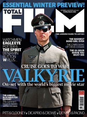
- Masthead takes up the top quarter of the cover - white against a dark background making it eye-catching
- Price
- Barcode
- Issue number
- A-list star on the cover - Tom Cruise is arguably the world's most recognisable actor - appears in medium long shot
- All the films advertised on the cover lines are recognisable and famous - The Curious Case of Benjamin Button, W, Valkyrie and Eagle Eye are all mainstream Hollywood movies featuring well known a-list stars
- Large eye-catching, blocky and bold font
- Colours stand out
- Website
- Bottom cover line references some of the world's biggest and most famous A-list actors - including Brad Pitt and Leonardo DiCaprio
Wednesday, 6 November 2013
Potential Poster Layouts
Before I can design my poster I need to sketch some possible layouts. Looking at other posters from all different genres really helped me with this task as it allowed me to see the variety of different layouts used in posters, and also how it changes depending on if the film is made by a Hollywood multimedia conglomerate or an independent production company. Having looked at posters from the horror genre has also helped me think about how genre might affect the layout - though, the influence of genre will be more apparent when I do my full sketches.
Below are my layout sketches:


Below are my layout sketches:


Tuesday, 5 November 2013
Horror Poster Analysis - "The Cabin in the Woods"
This
poster for the 2011 film “The Cabin in the Woods” features many of the typical genre
conventions that I have found in the other posters that I have looked at.

- Despite there not being any characters in this poster, the cabin is still in an isolated setting, indicating that the characters will be too. This is one of the most conventional features of horror movie posters
- The colour scheme is again muted, dark and bleak and there appears to be a real absence of colour on this poster. Dark colour schemes are typical of horror movie posters
- The poster appears to be scratched, giving it a chilling look. This is similar to the “Sinister” poster where it looks as if the walls have been cracked
- Every horror movie poster I have looked at has a release date or says “Coming Soon”, whereas some others from different genres do not. This possibly creates audience anticipation and could indicate an imaginary countdown until this sinister event happens
- The tagline directly references the audience and suggests a new take on some of the conventions of the genre
- The font has a sinister feel to it and appears to be smudged and scratched
Monday, 4 November 2013
Horror Poster Analysis - "Dead Silence"
This poster for the 2007 film “Dead Silence” features many genre conventions and it is clear it belongs to the horror genre.

- The dominant central image on this poster is of a ventriloquist's puppet. Its hand is sinister looking with extreme wounds. Manipulated children’s toys are frequent in horror movies like “Child's Play” and “Dolly Dearest”
- The colour scheme is again dark with accents of red and white - red indicating blood and danger, while white seems demonic and ghostly. This is a typical convention of horror movie posters
- The reference to the directors and other films from the genre is a convention of a horror movie posters, creating expectations amongst the audience
- The tagline “You scream, You die” directly references death and addresses this audience. When doing poster research I have frequently noticed this when analysing horror movie posters
- The ghostly white font is typical of the genre
Sunday, 3 November 2013
Horror Poster Analysis - "House at the End of the Street"
The poster
for the 2012 film “House at the End of the Street” features many genre
conventions.

- The central character is hiding, indicating something or someone is after her. It is ambiguous and the indirect mode of address is typical of horror movie posters
- The font looks scratched and ghostly - typical of horror movies
- The colour scheme is completely dark except for a yellow sepia glow coming from behind the door - this could indicate sinister events but also positivity. This is typical of horror movies with a central protagonist
- The tagline “Fear reaches out...to the girl next door” gives us the sense that this could happen to anyone, making us feel scared. Frightening the audience is a convention of horror movie posters.
- The setting seems isolated, but the girl is alone and it seems she is not being rescued
- The mise-en-scene, particularly the costume, sexualises the girl - a typical representation of vulnerable females in the genre
Saturday, 2 November 2013
Horror Poster Analysis - "Sinister"
This poster for the 2012 film “Sinister” and, again, features many genre conventions that belong to the horror genre.

- The colour scheme is muted - dark and bleak, apart from the blood the girl is smearing on the wall. The dark red indicates danger and is a frequent colour used on posters for horror films
- The image behind the girl is frightening and indicates the film's genre
- The setting of the poster does not give much away, but like previous posters of horror movies the girl seems isolated
- The tagline “Once you see him nothing can save you” directly addresses the audience and indicates death - this is typical of many horror movie taglines found on posters
- The character is seemingly a young girl - this is a recurring theme in horror films as adult audiences are proven to find films more chilling if they feature children
- The reference to the producer is a convention of a horror movie poster - in this case as it references other horror films ("Paranormal Activity" and "Insidious") it creates expectations amongst the audience
- The font of the title looks as if blood is seeping out of it - this makes it obvious it is from the horror genre
Subscribe to:
Comments (Atom)