Monday 21 April 2014

What have you learned from your audience feedback?

Throughout my research and planning I conducted various focus groups among my fellow students, teachers and family to help me with things like design and titles in order to find out what people would deem as authentic and eye catching.

All of the time I made my decisions based on these focus groups as I felt it was important to take audience opinion into account and respond to their ideas. After I had completed my marketing campaign I conducted further audience research to see if I had successfully achieved my aims in conveying genre and authenticity.

The questions I asked regarding my poster were:

1. Is the poster eye catching?
2. Can you tell which genre the film is from by looking at the poster?
3. Does the poster look authentic?
4. Does the poster contain all the conventions you would expect to find in a typical poster?


The main thing my audience picked up on was the font - they felt that it was in keeping with the genre (the genre-orientated reviews helped add to this idea) and purely from the font they would be able to tell straight away that it was a horror film. They also felt the bleak colour scheme, although would not be eye catching, would attract the attention of horror fans as that is what they are used to in posters of that genre. They suggested, however, that the slight accents of red text would help attract attention. The comments on the layout were positive with audience members saying it looked authentic.

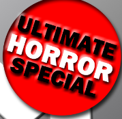
The questions regarding my magazine front cover were:

1. Does it feel like a mainstream magazine?
2. Would it catch your eye on the shelf?
3. Does the magazine help promote the film?
4. Can you tell the magazine is a horror special?


Because I used a well known director for my film, and older actors, it was difficult to put any stars on the cover. My audience feedback was that it was a good idea to make the magazine a horror special and they felt the colour scheme I used was eye catching, but also in keeping with the horror special idea. They questioned my decision not to use an actor on the cover but in the end they agreed that it was a better idea not to as they were older and wouldn't appeal to my target audience, or be considered eye candy. They also thought it was the right idea to use my teacher as a substitute for Wes Craven as he is a well known director (and I couldn't use a found image).

The questions I asked regarding my teaser trailer were:

1. Does the teaser trailer use typical conventions?
2. Can you see the genre from the teaser trailer?
3. Is the narrative established?


The feedback I got from this was that the trailer gave a bit of the narrative away but withheld a lot of information as teaser trailers do. The opinion on the music was that it effectively displayed the genre and the spotlight effect on the title was effective.

Finally with all elements of my marketing campaign I asked my audience if they all worked well together. They said that it was easy to see that all pieces were promoting the same film. The small consistencies like the font helped to tie them all together.

Sunday 20 April 2014

How did you use media technologies in the construction and research, planning and evaluation stages?

I chose to present my research and planning (and my evaluation) in the form of a blog, and in order to do this I set up a blogger account and accounts for YouTube and Soundcloud so I would be able to upload sound files and videos regularly onto my blog to show my research.


Using a blog to display my research and planning has had many benefits - not only is it easier to organize and manage tasks, but it is more engaging for the reader and it is easier to support my research with examples of images, video clips, sound files and links.

To film my teaser trailer I used a digital video camera (Panasonic HDC TM900) - it was easy to film this way with this camera as I could take a countless number of shots and it was easy to erase the shots I was not happy with.


In conjunction with the editing software I was able to upload my shots onto the system, arranging the shots in separate bins, giving me more time to edit.

As I found out in my research, taglines were a consistent convention of both posters and teaser trailers, and it was imperative to use them in my teaser trailer. To create my taglines I used photo shop and the software Marquee which allowed me to make the taglines move - but I chose to make a spotlight effect on my titles instead. I used the editing software Avid to edit my teaser trailer, I began by uploading all my shots putting them in separate editing bins.


This made it easy for me to access my shots when I needed them (as I had labelled each shot carefully). I had various other bins for music, sound effects, titles and captions. The benefits of organizing the editing this way was that it made editing the actual trailer much smoother - spending time organizing the material really paid off during the editing. Because I had created a shot list and storyboard I already had a running order, so the bins I had created allowed me to stick to it. To edit, I opened each shot and trimmed them and I went on to place each shot on the first layer of the time line. The multi track feature in the software allowed me to place all my shots onto one layer and all the other elements, like music and sound effects, and titles and captions on separate layers.


This allowed me to move different elements along the time line individually, so the mixing flowed much more seamlessly. The nine layers on the time line allowed me to add effects like audio and video fades (both essential components of teaser trailers)


When I decided on the music I wanted to use from Spotify I used the Adobe Audition software to cut down the tracks (on one particular track I isolated the majority of it apart from the end and added a fade at the end to make an impact sound). I recorded voiceovers then converted them onto mp3 and transferred them to Avid. The digital technology in post production allowed me to be creative and utilize all the software to create a successful teaser trailer.

The extensive use of Photoshop was what allowed me to successfully create my poster and magazine cover. Photoshop allowed me to be creative and manipulate images altering colour schemes and fonts. I used a range of tools including the magnetic lasso (the tool I used to crop around images to isolate them), the eye dropper tool and the smudge tool.


Here are the various stages of my poster as I was creating it with Photoshop.


Here are the stages of creation of my magazine cover, which I also created through using Photoshop.


Monday 14 April 2014

How effective is the combination of your main product and ancillary texts?

With any marketing campaign it is important to keep a sense of continuity across all of the media products that are being used to promote the film - so that audiences realise that each text is advertising the same film. A unified campaign helps establish an awareness of the film, almost bombarding the potential audience with constant images associated with the film, so that when they make a choice about what to see at the cinema, the film will be fresh in the audience's minds.

Throughout my campaign I tried to make sure that there were many consistent, unifying elements.
The title font on my teaser trailer and poster, for example, are the same font, making them instantly recognisable as belonging to the same film. When conducting my research I had to be very selective with the font I chose, because I knew I would be using it for both - it had to be effective on both the poster and in the teaser trailer. The font I used is called "Requiem", and I used it on the titles, taglines and the release dates on both my poster and in my teaser trailer.


This means that when the audience are watching the teaser trailer and looking at the poster they can see that they belong to the same film. For the magazine cover, I did not use this font as it needed a completely different font, independent of the film. This is because magazines have their own house style, that is consistent from issue to issue - whilst the film companies may be able to influence which image appears on the front cover of a magazine, it is unlikely that they will persuade the magazine publishers to change the font that they use on their front cover.
   
The tagline used for the poster and the teaser trailer is ‘A Missing Child...A New Beginning’. It is engaging and fearful, and by having the same tagline on the teaser trailer and poster it becomes easy for the audience to associate them together, by sound as well as sight. The tagline doesn’t give away any extensive detail about the plot, but the small hint may make the audience curious and build anticipation. There is no tagline for the magazine cover, however if there was it would not be the same as the film, it would be something that relates to the magazine emphasizing that it is independent from the film.

The main central image used in the poster is not the same as the image I would use on the magazine cover. Magazine covers often have pictures of well known directors, stars or characters (as I discovered when doing my magazine cover research). I used an image of my teacher who I am pretending is Wes Craven, as he is the director of my film (I did not want to use a found image of Craven).

I used the same credits/billing on my poster and my teaser trailer, though the font is different (SteelTongs for the poster and Requiem in the teaser trailer). 


This is because the use of billing/credits is conventional to both media products and there is nothing you can really change about them. They both include the same information. The only thing I did differently was, in the teaser trailer I spaced it out over two shots, where as in the poster I have it all in one paragraph.


The credits/billing, website and company logos are shown over two shots in the trailer. I did not include billing in my magazine as it is not a convention of magazines - instead, they include cover lines related to features or reviews of forthcoming films. The same goes for production company logos which are featured on my trailer and poster but would not appear on the magazine cover. 


The date of release is different on the poster than it is on the trailer. The teaser trailer is very early on in the film's marketing campaign, so it simply states that the film is coming out in ‘Fall 2013’ - this is vague as the distribution company may not have finalised a release date at this point in the campaign. The release date on the poster (which would have come out towards the end of the marketing campaign, after the film has been reviewed) is more specific - giving the actual date of release as October 24th. The magazine’s date is October of 2013, tying in with the release of the film. Coverage of the film in the magazine will act as one final push for the audience, persuading them to go and see the film just ahead of its release.

Sunday 13 April 2014

In what ways does your media product use, develop or challenge forms and conventions of real media products?

For the main part of my A2 Advanced Production I planned, filmed and edited a teaser trailer from the horror genre. Before I was able to do this, however, I had to do research into conventions to see what was appropriate to put, not only in my teaser trailer, but on my magazine cover and poster. 


For teaser trailers, to begin with I looked at a series of teaser trailers and compared them to theatrical trailers, this helped me decide on the differences in terms of content and structure. The trailers I looked at were for the films "Priest" and "Super 8". Both films were big budget Hollywood blockbusters, and when looking at other teaser trailers later on I realised that most of them also had an existing audience like "Thor". 

I made a list of all the differences between the teaser trailers and theatrical trailers as I noticed that the differences were almost exactly the same in each one, like the withholding of information, the use of impact sounds, and the fact that the editing was much more rapid in the teaser trailer. 


I then looked at a series of teaser trailers and big game spots (from different genres) to see if the camerawork, editing and sound were all consistent, and picked out conventions from these - such as the production company logos at the start, style of camerawork, taglines and release dates. I used the majority of the conventions I found in my research for my teaser trailer "The Mourning". As you can see if you watch my trailer below, it includes the production company logos (associated with the horror genre) at the beginning, the title of the film is towards the end of the trailer, vague release date ("Fall 2013"), tagline was split up, music that indicates genre, impact sounds, rapidly edited montage (towards the end of the trailer) and reference to source material (based on the novel by Stephen King).


The second task I had to complete was my poster. To begin the research for my poster I looked at a variety of existing posters from different genres to get a sense of the conventions - for example I looked at "What Happens in Vegas" (comedy), "Stolen" (action) and "Dark Shadows" (fantasy). I found a number of conventions that appeared in almost every single one regardless of the genre, including billing and credits, the fact that the film's title was always the biggest font on the page, release dates and ratings/reviews. 

To make my poster authentic I tried to use all the conventions of layout and design that I found in my research, regardless of the genre. When I decided that I wanted my marketing campaign to be for a Horror film, I looked at a variety of posters from the genre like "Sinister", "The Possession" and "Dead Silence", taking note of how the genre is presented in each poster through iconography, colour scheme, font and props. I tried to display the genre of my marketing campaign in my final poster, using quotations from reviews (taken from appropriate magazines and using words that reflect the genre), font that reflects genre, a tagline that references genre, a colour scheme that reflects the genre (black, white and red) and an image that implies genre. 

  Reviews were a convention I found on posters which entice audiences to see films, so I included four reviews on my poster. 


Something else I found on posters was that the title is always the biggest font on the poster. I took this into account when creating my poster.


Tag lines are almost always featured on posters. I did my tagline research by looking at other tag lines used on Horror film posters, before coming up with my own.


Billing and credits are not only used in the poster, but on the teaser trailer as well. 


Websites appeared on almost every poster - these are used to encourage potential audiences to find out more about the film by going online, thus creating a buzz ahead of the film's release.


Release dates build anticipation amongst viewers, and is a typical convention found in posters.


When doing my research into magazine covers I realised that regardless of the type of publication, the conventions were the same - including a masthead, cover lines, date, issue number and a bar code! 

The main difference between a mainstream cover and an independent magazine cover was the image on the front - magazines like Empire and Total Film always have a recognisable star or character on the cover, whereas magazines like Sight and Sound have images of lesser known actors or directors.


Magazine covers build anticipation to the films release so it is important to use all the conventions to attract audience attention. I made a conscious effort to use most, if not all of, the conventions I found in my research in my final magazine cover.


Circular banners were something I found on almost every mainstream magazine cover. I used one on my cover, in a bright eye catching colour.


Barcodes make the cover look more authentic and, despite the type of magazine, all covers featured one.  


Mastheads are the first thing that is noticed on a magazine cover. The have to be the largest font of the page and catch the audience's eye.


Cover lines all feature films that are coming out at similar time as the main film that is being featured. For the cover lines for my my magazine cover I researched what films of the same genre (as my magazine was a genre special) were coming out around October time.


All magazine cover feature an issue number, date and price. 


I hope you can see that I've tried to use as many of the conventions of each type of media text in the ones that I produced.