I made a list of all the differences between the teaser trailers and theatrical trailers as I noticed that the differences were almost exactly the same in each one, like the withholding of information, the use of impact sounds, and the fact that the editing was much more rapid in the teaser trailer.
The second task I had to complete was my poster. To begin the research for my poster I looked at a variety of existing posters from different genres to get a sense of the conventions - for example I looked at "What Happens in Vegas" (comedy), "Stolen" (action) and "Dark Shadows" (fantasy). I found a number of conventions that appeared in almost every single one regardless of the genre, including billing and credits, the fact that the film's title was always the biggest font on the page, release dates and ratings/reviews.
To make my poster authentic I tried to use all the conventions of layout and design that I found in my research, regardless of the genre. When I decided that I wanted my marketing campaign to be for a Horror film, I looked at a variety of posters from the genre like "Sinister", "The Possession" and "Dead Silence", taking note of how the genre is presented in each poster through iconography, colour scheme, font and props. I tried to display the genre of my marketing campaign in my final poster, using quotations from reviews (taken from appropriate magazines and using words that reflect the genre), font that reflects genre, a tagline that references genre, a colour scheme that reflects the genre (black, white and red) and an image that implies genre.


Something else I found on posters was that the title is always the biggest font on the poster. I took this into account when creating my poster.


Tag lines are almost always featured on posters. I did my tagline research by looking at other tag lines used on Horror film posters, before coming up with my own.

Billing and credits are not only used in the poster, but on the teaser trailer as well.
Websites appeared on almost every poster - these are used to encourage potential audiences to find out more about the film by going online, thus creating a buzz ahead of the film's release.


Release dates build anticipation amongst viewers, and is a typical convention found in posters.
When doing my research into magazine covers I realised that regardless of the type of publication, the conventions were the same - including a masthead, cover lines, date, issue number and a bar code!
The main difference between a mainstream cover and an independent magazine cover was the image on the front - magazines like Empire and Total Film always have a recognisable star or character on the cover, whereas magazines like Sight and Sound have images of lesser known actors or directors.

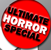
Circular banners were something I found on almost every mainstream magazine cover. I used one on my cover, in a bright eye catching colour.

Barcodes make the cover look more authentic and, despite the type of magazine, all covers featured one.


Mastheads are the first thing that is noticed on a magazine cover. The have to be the largest font of the page and catch the audience's eye.


Cover lines all feature films that are coming out at similar time as the main film that is being featured. For the cover lines for my my magazine cover I researched what films of the same genre (as my magazine was a genre special) were coming out around October time.


All magazine cover feature an issue number, date and price.


I hope you can see that I've tried to use as many of the conventions of each type of media text in the ones that I produced.
No comments:
Post a Comment